Why a Room Needs a Visual Pause
A visual pause helps a room feel legible by giving the eye relief between focal points. Learn where to create one without making the space feel bare.
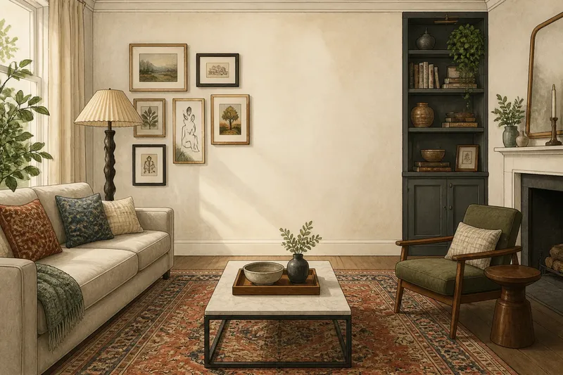
A visual pause gives the eye somewhere to rest between the pieces competing for attention. In a living room with a patterned rug, a gallery wall and a sculptural lamp, a relatively quiet stretch of wall or floor can make the arrangement easier to read. The aim is not an empty room; it is a clear interval.
What is a visual pause?
A visual pause is an area with less detail, contrast or visual weight than its surroundings. It might be a plain wall beside framed pictures, an uncluttered patch of floor around a chair, or a simple expanse of sofa upholstery between cushions. Its quietness is relative: a pale wall feels calm beside a dark bookcase, but may become a focal point if everything else is equally pale and plain.
Think of a room as a sequence of visual events. A bold object catches attention; a quieter area gives that attention time to settle before the next detail arrives. Without such intervals, separate features can blur into one busy impression, even if each object is attractive on its own.
Why does visual density matter?
Visual density is the amount of detail and contrast gathered into a particular area. A mantel crowded with framed photographs, ceramics and a mirror has more visual density than the clear wall above a simple console. Colour changes, sharp edges, repeated patterns, small objects and strong light-dark shifts all add to that density.
Density is not the same as clutter. A tightly arranged row of books can read as one composed block; a few unrelated objects scattered across a broad surface may feel more unsettled. What matters is how many distinct signals ask to be noticed, and how close together they appear.
Contrast helps the eye separate those signals. A dark frame against a pale wall stands out; several dark frames, a bright print and a glossy mirror nearby create a more insistent cluster. A pause interrupts that sequence with fewer changes in colour, pattern or shape. It lets the surrounding focal points remain distinct rather than turning the whole room into one continuous announcement.
Where should a pause go?
Place a quiet area between features that already attract attention, or beside a focal point that needs room to register. If the fireplace has a strong surround and the opposite wall holds large artwork, a simpler stretch of wall between them can prevent every surface from competing at once. In a small room, even a clear section of tabletop or floor can do the job.
Start by looking at the room from its usual entrance and from the seat where you spend the most time. Notice where your gaze lands first, then where it goes next. If it jumps between several high-contrast clusters with no quieter interval, decide which one deserves attention and reduce detail around it.
Say you have a compact sitting room with a patterned rug, a gallery wall and a coffee table covered in books and ceramics. If the gallery wall is the intended focal point, you could clear the table except for a tray and one bowl, leaving more of the tabletop visible. The expected visual result is a more legible sequence: the wall catches the eye, then the simpler table offers a pause instead of making another bid for attention.
How quiet should it be?
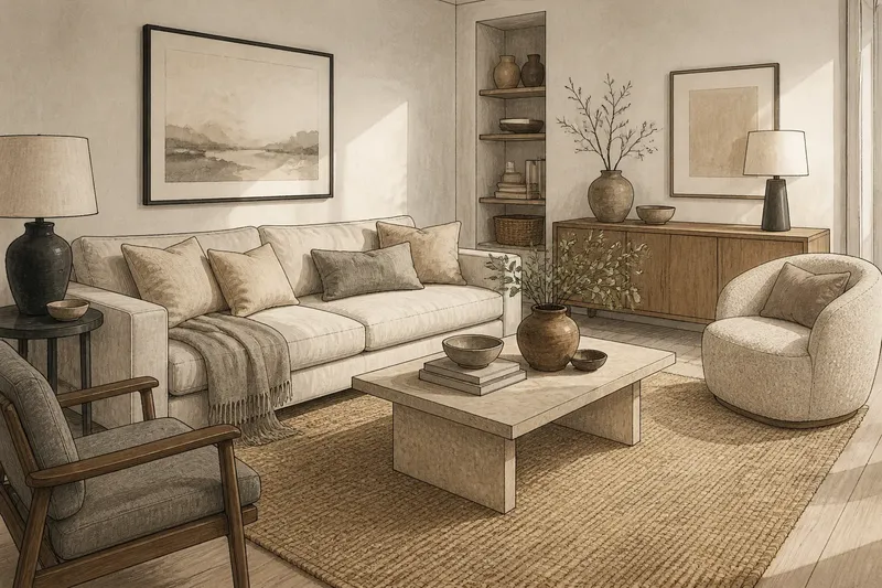
A pause should have less visual activity than its neighbours, not necessarily none. A wall painted in the same colour as the room can still offer relief beside a lively print. A plain linen cushion can settle a sofa dressed with textured cushions, while a clear patch of floor can separate a busy rug from furniture with strong silhouettes.
Keep some connection between the quiet area and the rest of the room. Repeating a nearby colour in a restrained way, or keeping materials compatible, helps the pause feel deliberate rather than forgotten. The contrast should be noticeable enough to interrupt density but not so dramatic that the supposedly restful area becomes a new focal point.
There is no need to remove every small object or paint every wall a neutral shade. That is usually more effort than the problem calls for, and can replace visual crowding with a room that feels oddly unresolved. Edit the strongest cluster first, then judge the room again.
How can you tell if it works?
Look for a clearer visual order. You should be able to identify a main focal point, notice the quieter interval around it and then take in secondary details without feeling pulled in several directions. If the room still reads as a series of competing clusters, the pause may be too small, too decorative or placed where it cannot separate anything.
Also check whether the quieter area looks intentional from more than one viewpoint. A cleared surface that appears calm from the doorway may still be crowded from the sofa. Move through the room and notice whether furniture edges, lamps, frames or stacked objects overlap in ways that create accidental density.
What questions come up?
Does a visual pause mean an empty wall?
No. It means an area carries less detail or contrast than nearby areas, so a wall with one modest picture may still provide a pause beside a crowded bookcase. The useful test is whether the area gives the eye relief, not whether it contains nothing.
Can a small room have too many focal points?
Yes, particularly when patterned textiles, artwork and accessories all have strong contrast close together. Choose which feature should lead, then simplify one adjacent area rather than stripping the whole room of character.
Can colour create a visual pause?
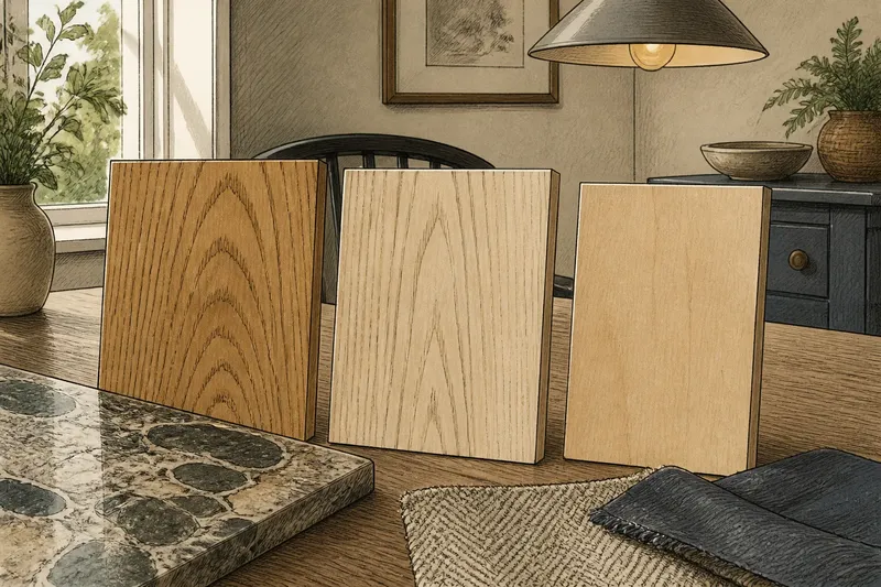
Yes. A quieter colour field can ease the transition between bolder features, while a strong colour contrast can increase visual density and make an area more prominent. Consider the colours as they appear together in the room, not only as separate paint or fabric samples.
When does a pause feel awkward?
A quiet area can look accidental if it is surrounded by busy elements without any visible relationship, or if a single object sits isolated without a reason. It can also feel like a gap in the arrangement when furniture leaves a large bare patch that interrupts how people move through the room. In those cases, shift the pause to a wall, surface or floor area that already sits between visual clusters.
For a room that feels crowded, try reducing detail in one carefully chosen place before buying anything or rearranging everything. A visual pause works by making the room’s existing arrangement easier to see. Once the eye has a little space, the objects that remain can speak at a sensible volume.