The All-Neutral Room Is Not Automatically Calm
An all-neutral room can still feel restless. Learn how contrast, texture and repetition shape its mood, and where a little tonal editing helps.
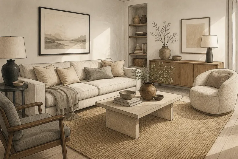
An all-neutral room can feel busy before anyone has added a single bright colour. A cream sofa against a white wall, a pale rug, a grey throw and several beige cushions may sound restrained, yet their edges, surfaces and repeated shapes still compete for attention. Neutral colour removes one source of visual noise; it does not remove visual decisions.
The useful question is not whether a room contains colour, but how the eye moves through it. Contrast creates emphasis, texture adds detail and repetition gives objects a rhythm. In a neutral scheme, those elements carry more of the mood because hue is doing less work.
Neutral is not uniform
Neutral usually describes a family of colours that sit quietly beside many others: whites, creams, greys, browns and muted earth tones. It does not mean colourless, nor does it mean that every surface is interchangeable. A warm ivory wall and a cool grey sofa may both be neutral, but their difference can read as a distinct boundary.
That boundary matters. A room with close tonal values can feel soft and blended, while one with a dark charcoal chair, pale walls and a mid-grey rug has a clearer visual structure. Neither arrangement is automatically calmer. The first may look hazy if the surfaces blur together; the second may feel orderly, or stark, depending on how many strong edges the eye has to track.
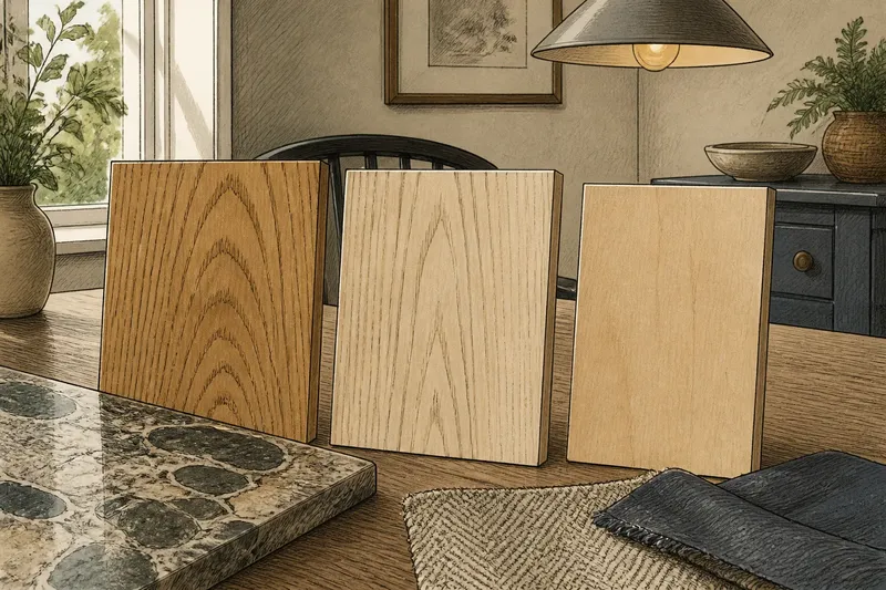
Undertones add another layer. A white with a yellow cast can sit comfortably beside linen and natural timber, while a blue-toned white may make those same materials seem warmer by contrast. These shifts are subtle, but a large wall gives them enough area to register. Samples viewed beside the actual flooring and upholstery are more useful than a colour name that sounds reassuring.
Contrast sets the pace
Contrast is the difference between neighbouring elements: light against dark, smooth against rough, or a crisp outline against a soft one. It directs attention, even when every item belongs to a restrained palette. A black picture frame on a pale wall can attract the eye more quickly than a richly coloured cushion in a similar tone to the sofa.
Strong contrast is not a flaw. It can make a room feel clear and composed, especially when it is repeated with restraint. But when each object introduces a new contrast—black lamp, dark table legs, sharp white pottery, a strongly patterned rug—the eye keeps making small adjustments. The room may read as lively rather than restful, despite its limited palette.
Look at the room from the doorway and notice the first three things that catch your eye. If they are all unrelated, the issue may be contrast rather than colour. Consider whether one dark accent can be echoed elsewhere, or whether an isolated high-contrast object would sit more comfortably in a quieter position. Repetition gives an accent company; it need not turn the whole room into a matching set.
Texture adds visual noise
Texture is not only what a fabric feels like under a hand. It is also the pattern of light and shadow on its surface. Slubby linen, ribbed wool, boucle upholstery, woven baskets and brushed plaster all make fine irregular marks. In a colourful room, those marks share attention with hue. In an all-neutral room, they become more prominent.
A mix of textures can keep a neutral scheme from feeling flat, but every added surface carries visual information. Several coarse weaves, visible grain patterns and highly nubby fabrics may produce a crowded effect, even if their colours are close. Conversely, a room made entirely of smooth, reflective finishes can look hard and exposed. Calm often comes from a deliberate range: some surfaces with detail, others that let the eye settle.
Imagine you have a pale linen sofa, a chunky wool throw and a jute rug, all in nearby shades. If the room feels busier than expected, try removing the throw for a while and observe whether the sofa and rug become easier to read as separate forms. The likely change is not a new colour effect but a simpler pattern of surface detail. If the room then feels too bare, bring back one textured layer rather than adding several small accessories at once.
Repetition can soothe
Repeated shapes and materials make a room easier to read. A few rounded forms, a recurring timber tone or a consistent finish on lamps and frames can connect separate objects without making them identical. Repetition is especially useful in neutral rooms because it gives the eye a pattern to follow when there is little colour variation to organise the scene.
Too much repetition, though, becomes insistence. Matching cushions, identical baskets and the same pale finish on every object may make a room feel staged rather than settled. The aim is not to duplicate each item, but to repeat a quality: curved outlines, matte surfaces or a particular warm-grey tone. Small variations keep the pattern from becoming a display of coordinated purchases.
One practical way to judge repetition is to look for the same feature in several places, then ask whether it links the room or merely multiplies itself. A repeated dark outline can draw a loose path from a frame to a lamp base and a chair leg. If every object has the same dark outline, the path has become a grid.
Where does calm come from?
Can an all-neutral room feel warm?
Yes. Warmth can come from undertones, timber, soft-edged forms and surfaces that absorb rather than sharply reflect light. A room need not add a strong colour, but the neutral shades should relate to one another rather than each pulling in a different temperature.
Why does a beige room look busy?
Beige does not cancel contrast or detail. Busy edges, many small objects, varied patterns and a dense mix of textures can all create movement within a narrow palette.
Should every neutral match?
No. A little variation gives the room depth, provided the differences have a reason. Keep some tones close for continuity, then use a limited number of clearer contrasts to establish the main forms.
What is not worth the effort?
Trying to make every neutral object the exact same shade is rarely useful. Materials change appearance with their finish and the light on them, so chasing a perfect match can leave the room more fussy, not more coherent.
Edit by visual weight
When a neutral room feels unsettled, start with the objects that have the strongest visual weight: the largest dark shapes, the most pronounced patterns and the most textured surfaces. These usually matter more than the small accessories gathered on a shelf. Move or remove one prominent element at a time, then look again from the main entrance and from the place where you usually sit.
Do not treat the result as a test with a correct answer. The room may need a focal point, a stronger contrast or a rougher surface; it may instead need fewer competing details. Keep the parts that give the space character and reduce the ones that repeat a quality already present. An all-neutral room becomes calm not by avoiding colour at any cost, but by making its contrasts, textures and repetitions feel intentional.
For a useful final check, view the room in both daylight and its usual evening lighting. A pale surface can appear crisp in one and subdued in the other, changing which edges dominate. That simple comparison can reveal whether the room needs another colour—or simply a quieter arrangement of the colours already there.