Oak, Ash and Beech: Reading Three Wood Grains
Compare oak, ash and beech wood grain in your room to choose a furniture or joinery surface whose pattern sits comfortably with existing materials.
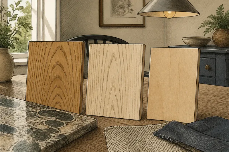
Oak, ash and beech wood grain can change the feel of a table or cabinet before its shape has had a chance to make an impression. Compare the actual samples in your room, not just the species names, and the lines, contrast and colour become easier to judge.
A week gives you time to see those samples in changing light without turning a furniture choice into an archaeological enquiry. The aim is not to find the universally best wood. It is to choose a grain that sits comfortably beside the lines and colours already in the room.
Room patterns
Start by noting which nearby surfaces already carry a strong pattern: the floor, a stone worktop, woven upholstery, a rug or another piece of timber. Describe their marks as straight, branching, mottled or nearly invisible. This shows how much visual activity the room already contains; it does not require every pattern to match.
Record the main colours nearby and the woods you are considering. Oak, ash and beech vary between boards, finishes and products, so a species label cannot predict exactly how a particular surface will look. A pale timber may appear warmer beside blue-grey paint and more yellow next to a cool white wall.
It is not worth trying to identify a species from a photograph of a finished room. Stains, coatings and lighting can all alter the appearance. A photograph may suggest a direction; a physical sample gives you a more useful comparison.
Grain differences
Look at the grain before judging overall colour. Oak commonly has prominent grain, with variation between boards. Some cuts show broad, sweeping marks; others look more linear. Its visible structure can make a table, cabinet front or floor a distinct feature.
Ash often has long, open grain that draws the eye along a board. That direction can stand out on a wide tabletop or a run of cupboard doors. Beech is generally finer and more even by comparison, with less obvious contrast in many pieces; it can leave the outline of a chair or cabinet to carry more attention.
These are tendencies, not promises about every board. Cut, grade, finish and board selection all affect the result. Compare actual samples and look at the contrast within each one, rather than relying on the name printed on a label.
Sample placement
Ask for samples large enough to show several grain lines. Put each beside the floor, wall and nearby fabrics where the proposed furniture or joinery will sit. View samples upright as well as flat if the finished piece will be vertical; grain can read differently across a door than across a table.
Check them in daylight and with the room lights on. Move them around rather than leaving all three in one bright patch. A surface near a window may look different from one beneath a pendant or in a shaded corner. Judge whether the grain works beside the room’s other large surfaces, not whether it looks attractive on its own.
Say you have a small dining room with a busy stone floor and a plain painted wall, and you are choosing a table. You place hypothetical oak, ash and beech samples beside the floor, then move each to the table’s intended position and view them in daylight and under the pendant. If the oak seems to compete with the floor, the ash’s lines feel too directional, and the beech looks quieter, your resulting choice is beech for this setting; the trade-off is a less prominent tabletop pattern, not a rule that beech suits every dining room.
Scale and finish
A small sample can understate how much pattern a larger surface will carry. Ask to see the same finish across a full door or tabletop, or inspect a finished piece if available. Look for variation between boards and for how grain lines meet at joins. A small, uniform swatch represents a larger item only loosely.
Consider the furniture’s shape as well as its size. Strong grain becomes a major feature on a broad, simple tabletop. On a chair with turned parts, rails and joints, the silhouette may already be visually intricate. More even wood can keep those parts legible; pronounced grain adds another layer of pattern.
For flooring, look at several boards together. Grain direction, board selection and the arrangement of joins affect the overall impression, and one sample cannot show that repetition. Ask for a larger display or images showing a group of boards.
Finish changes how grain catches light and how strongly its marks stand out. Clear coatings can deepen or warm the timber’s appearance; coloured stains alter its tone and may emphasise parts of the pattern. Matt and glossier surfaces reflect light differently. Compare samples with the intended finish, not raw timber against a finished product.
Keep the comparison focused. If each sample has a different species and a different stain, it is difficult to tell which quality drives your response. Where possible, compare the woods in finishes with a similar sheen and close colour range. Then look at what remains distinct: grain direction, contrast and regularity.
Furniture relationships
Use the grain to support the object’s role. If a cabinet is meant to recede beside a patterned floor, a restrained surface may sit more quietly. If a plain dining table needs to hold its own in a spare setting, more expressive grain may be welcome. The room decides; neither is a rule for all homes.
Adjoining timber need not match exactly. Matching species does not ensure matching colour or grain, especially across different products. Shared warmth, similar grain scale or a compatible finish can make pieces relate while remaining visibly different. Take samples to the furniture already in the room instead of relying on memory, which is an enthusiastic but unreliable colour chart.
Final decision
Return to the room at the times you normally use it. Look at the samples beside the floor in daylight, then near the intended piece with the evening lights on. Before choosing, use this decision list; for each observation, follow the stated branch or use the alternative action.
- Observe whether a sample’s grain competes with a patterned floor; if it does, compare a quieter sample in the same position, otherwise keep it in the running.
- Observe whether the grain direction feels too strong across a wide surface; if it does, compare a less directional sample, otherwise retain the option.
- Observe whether the sample looks too pale, warm or cool beside the wall and fabric; if it does, ask for a closer colour match with a similar finish, otherwise keep the colour candidate.
- Observe whether the finish changes the grain’s contrast under the room lights; if it does, request a sample with the intended sheen or stain, otherwise continue with the current finish.
- Observe whether the full-size image shows board variation or joins you dislike; if it does, ask for another board selection or finish, otherwise keep the product under consideration.
- Observe whether the product description identifies solid timber, veneer or a combination; if that differs from what you want, ask the seller to clarify the specification, otherwise proceed to the final visual comparison.
Check the product description, finish sample and care guidance before buying. Wood names can cover varied appearances, and product specifications may describe veneer, solid timber or a combination. If a decision depends on the maker’s care instructions or local requirements, follow the relevant guidance rather than inferring it from the grain.
Which wood grain suits your room?
Is oak always the most noticeable?
Oak often has pronounced grain, but the effect varies with the board, cut and finish. Compare the actual surface with nearby patterned materials before deciding that its contrast is too strong.
Does ash look lighter than beech?
Not reliably by species name alone, since finish and individual boards affect perceived colour. Ash’s open, directional grain may make a surface feel more active even when its tone is pale.
Is beech too plain for a feature piece?
Not necessarily. An even grain can make a furniture shape, joinery detail or carefully chosen colour more legible, so the result may feel understated rather than plain.
Can different woods share one room?
Yes, if their relationship is considered rather than accidental. Compare warmth, grain scale and finish in the room itself; identical species names matter less than how the actual surfaces sit together.
Oak, ash and beech are three kinds of visual movement, not fixed interior styles. For a wood grain choice that feels settled, judge the board in its intended position, at its intended scale and beside the materials it must live with. The species name starts the comparison; the grain in the room finishes it.